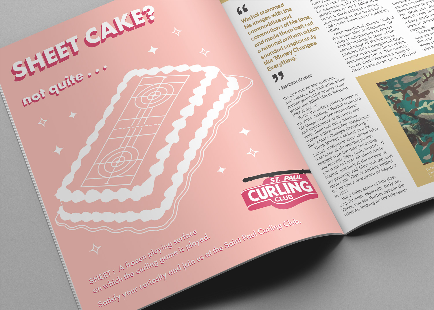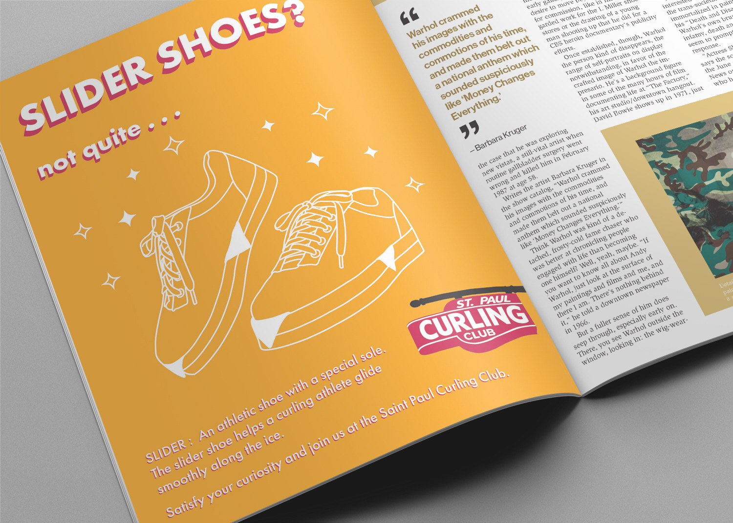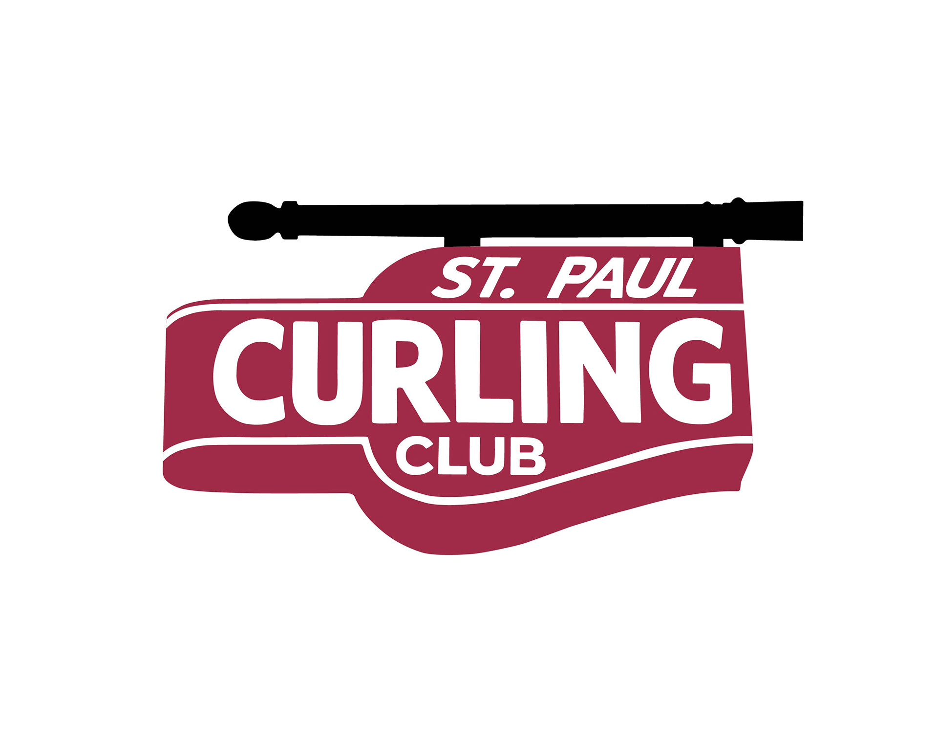
The following is a series of three magazine ads that were created for a fictional promotional campaign. The campaign was aimed at attracting young professionals to the sport of curling while shining a light on the Saint Paul Curling Club. Curling is a unique indoor ice sport with its own complex set of terminology. Each ad was inspired by curling terms and juxtaposes two unrelated objects to create visual interest. The Saint Paul Curling Club logo was based off a unique, vintage outdoor sign displayed near one of the curling club entrances. A Futura font was also applied because of the way it mirrors the vintage Saint Paul Curling Club signage
.